Accessibility on the web refers to the measures that make websites more inclusive for people with different abilities. This can be as simple as ensuring proper color contrast for the visually impaired, adding alt text so screen readers can describe images, or including transcripts for videos to support those who are hard of hearing.
While the conversation around accessibility is growing, it’s still often overlooked. I build websites for a living and make accessibility a priority in my projects, yet I still catch myself missing things. What I’ve learned is that comfort with accessibility doesn’t come overnight—but small, consistent steps make a real difference.
In this blog post, I talk about a few techniques I use with my WordPress sites to help with accessibility. This is not a full deep-dive into accessibility (so I won’t be covering semantic HTML, screen reader behavior, or WCAG standards), but rather a look at practical tweaks that can have a big impact.
Accessibility is NOT a feature. It is a REQUIREMENT.
WordPress Challenges
Before going to my tips and tricks, I want to bring to light one challenge that WordPress presents that doesn’t often get talked about — client-controlled content. Most custom-coded WordPress builds (not pagebuilders like Divi or Elementor) are structured in a modular way. That is, flexible content blocks and dynamic fields that can serve different purposes across the site (think of it like reusable legos).
Once the site is handed over, however, content is in the client’s hands. And even with strong accessibility foundations in place, poor content management can undermine them.
Take a Call-To-Action (CTA) block, for example. On one page it might say “Create an Account,” while on another it says “Read an Article.” The block is the same, but the context—and accessibility considerations—are different. As developers, it’s tough to anticipate every possible use case and future-proof blocks for accessibility.
With this in mind, I’ll share three techniques I use to strengthen accessibility in my builds—both from a code perspective and in the WordPress admin UI. These aren’t hard-and-fast rules, but practices I’ve developed through client work and lessons learned from ADA audits.
(Note: Familiarity with code and Advanced Custom Fields (ACF) is needed for what follows.)
Section Aria-Labels
As we mentioned earlier, most custom builds involve building custom blocks. These custom blocks are then stacked onto one another in whatever order in a modular fashion to form pages. In most of my builds, each custom block represents a section of content wrapped in a <section> HTML tag.
Usually, most sections will include a heading or a title that gives information about what that section is all about. However, sometimes the content isn’t clear or lacks proper structure because of client management. This is where an aria-label comes into play. In short, an aria-label can be attached to a <section> tag to describe the overall purpose of a section.
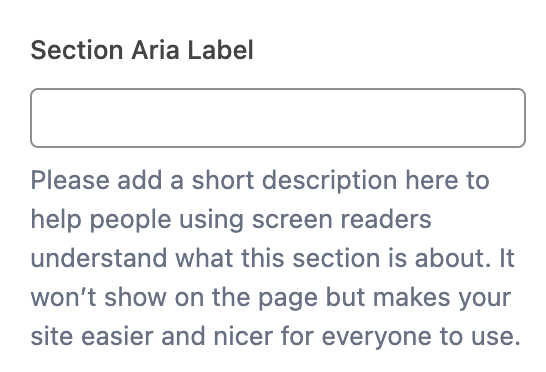
What I do is add an “aria-label” field in ACF, so the client can supply a short description for each section. I also provide guidance on how to fill it out—just a few words that capture the purpose of that section. This creates a fallback in cases where the content is thin or poorly structured, ensuring assistive technologies like screen readers can still announce the section’s intent to users.
Below is an example of the ACF field I provide to clients (screenshot), followed by a snippet of how it gets implemented in code.
<?php $section_aria_label = get_field('section_aria_label'); // Pull the aria-label from ACF ?>

<!-- Dynamic version -->

<!-- The aria-label describes the purpose of this section for people using screen readers. It tells them what this section is about, even if they can't see the content visually. Here, it is dynamically filled by the value entered in the 'section_aria_label' ACF field. -->

<section
id="about-section"
class="content-section"
aria-label="<?php echo esc_attr($section_aria_label); ?>">
  <!-- code here -->
</section>

<!-- Hardcoded version: This is what it will be outputted as on the front end. The aria-label describes the purpose of this section for people using screen readers. Screen readers will announce: "About Our Company," letting users know what this section is about. -->

<section id="about-section"
class="content-section"
aria-label="About Our Company">
  <!-- code here -->
</section>
It may feel like a small detail, but accessibility often comes down to these small details. With aria-labels in place, even imperfect content has a stronger foundation.
Heading Tags
Heading Tags (H1, H2, H3, etc.) are HTML tags meant to provide a hierarchy of information on a page. An <h1> introduces the highest-level topic, <h2> marks a subsection, <h3> marks a subsection of that, and so on down to <h6> . Assistive technologies like screen readers rely on this structure to help users understand the page outline and navigate between sections efficiently.
Visually, headings are often styled in descending size—<h1> being the largest and <h6> the smallest—but that styling is controlled by CSS. The important part is that headings follow a logical order, with <h1> typically near the top of the page, followed by <h2>, then <h3>, and so on.
The problem is since blocks can go anywhere in WordPress, depending on where they are placed, the appropriate tag could be <h2>, <h3>, or <h4> in any given situation. And with non-technicals, the priority tends to be how large the font is, not whether the appropriate heading level is being used.
I do a few things to help combat this. First off, I try to make sure every module has some sort of title element – and if I am working with a designer I will provide that as feedback if it isn’t there initially in a mockup. Secondly, I will have the title be filled in with a static text field, rather than a WYSIWYG where the client can adjust the sizing. Finally, I will provide a separate ACF field that allows the client to wrap the title in any heading tag WITHOUT affecting the visual presentation of the title.
Below is an example of the ACF dropdown field I provide to clients (screenshot) to select their choice of heading level.
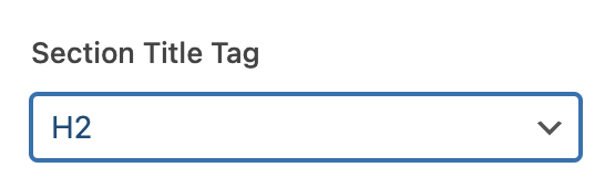
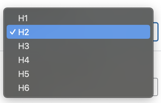
While the title will present consistently at a certain font, the code itself will be read as the appropriate heading tag. Below is the corresponding code using the field above.
// The below function takes a heading, wraps in the selected heading tag, // but maintains the visual integrity of the heading element.

function pw_seo_heading( $title, $tag = 'h2', $custom_class = '' ) {

    // Return empty if title is empty or tag is invalid

    if ( empty( $title ) ||
        !in_array( strtolower( $tag ), [ 'h1', 'h2', 'h3', 'h4', 'h5',          'h6' ] ) ) {
        return '';
    }

    // Build class attribute if custom class is provided

    $class_attr = $custom_class ? ' class="' . esc_attr( trim( $custom_class ) ) . '"' : '';

    // Return formatted heading HTML
    return sprintf(
        '<%1$s%2$s>%3$s</%1$s>',
        esc_html( $tag ),        // heading tag
        $class_attr,             // optional class attribute
        esc_html( $title )       // heading content
    );
}

<?php
// Hardcoded example: H6 tag, visually styled with an H2 class
// Screen readers and search engines will treat this as an H6 heading,
// but visually it will look like an H2 because of the CSS class.

<h6 class="h2">Section Title</h6>

?>
This approach keeps the heading hierarchy intact while still giving clients the flexibility to manage content without breaking accessibility.
Making Buttons/Links Dynamic
This final section is about buttons and links (I will use these terms interchangeably in this section), which are some of the most important elements (in my opinion) to consider when implementing proper accessibility practice. Buttons and links are what allow your user to navigate to other pages and complete actions to properly explore your site.
With buttons and links, the most vital aspect for assistive technology is to inform the user what the purpose of the button is. Usually this will be done using the text on the button. The problem is, a lot of times the client (and even developers) will be very generic with their button text using phrases like “Learn More”, “Explore”, “View”. These are fine in theory, but imagine a page with four buttons and they all say “Learn More”. A user using assistive technology won’t know which one does what because all it will read is “Learn More” (LEARN MORE WHAT?!).
Buttons and links are what allow your user to navigate to other pages and complete actions to properly explore your site.
Ideally, the fix would be having your button text more specific, but long text can break design. This is where the aria-label attribute comes in. This allows you to announce the purpose of the button while keeping the button looking clean.
Here is an example of that in motion:
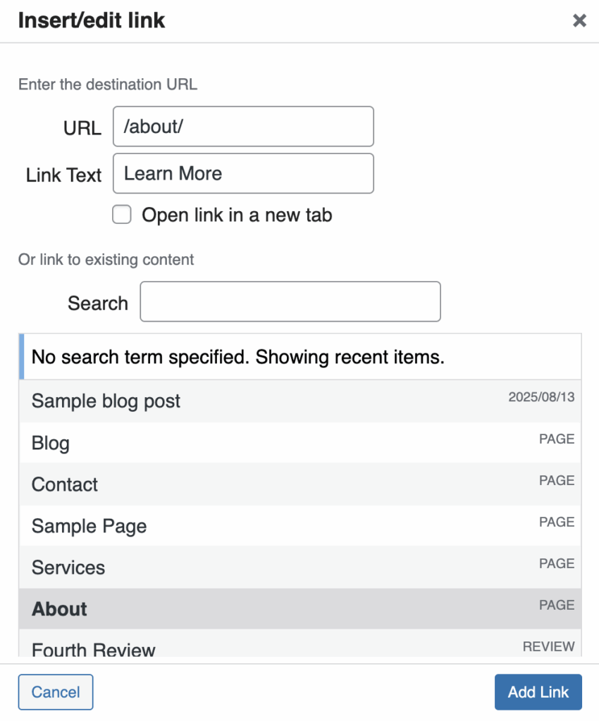
- Usually, to put a button on the page, the client will choose/fill out the URL that button is meant to go to, as well as the button text. See Figure A.
- You could educate the client and tell them to use more specific button text, but this doesn’t always happen.
- To combat this, in code (provided below), I will dynamically pull the destination URL and insert it with my aria-label.
- This way, regardless of the client action, there is a some sort of fall back to help with ADA compliance. Now the assistive technology will read something like “link goes to example.com/about/” rather than just “Learn More”.
Below is a code snippet of how to implement a dynamic, ADA friendly button using user inputs as fallbacks.
<?php
$button = get_field('button_field'); // Grabs what is selected in the link picker
if ($button) {
    $button_url  = esc_url($button['url']); // Grabs the entered URL
    $button_text = esc_html($button['title']);
    ?>
    <!-- Dynamic version -->
    <a href="<?php echo $button_url; ?>"
       aria-label="Go to <?php echo $button_url; ?>"> // Put that URL in an aria-label to read to screen-readers
        <?php echo $button_text; ?>
    </a>
    <?php
}
?>

<!-- Hardcoded version -->
<a href="https://example.com/about" aria-label="Go to https://example.com/about">
    Learn More
</a>
Using aria-labels ensures that buttons and links remain visually clean while still providing meaningful context for users of assistive technologies. Small tweaks like these can make buttons much more accessible, without changing how they look to everyone else.
Closing Thoughts
The above techniques, while I believe they are helpful, are just some approaches I’ve come up with. There are many ways to make a WordPress site more inclusive—some are better than others, and no approach is perfect. Still, even small measures, like using aria-labels on section tags, proper heading tag hierarchy, and descriptive buttons, can go a long way.
To me, while the code is important, what matters most for developers is taking a moment at the start of and throughout a build to think about accessibility. The techniques discussed here help build the habit of keeping accessibility top of mind. At the end of the day, remember: Accessibility is NOT a feature. It is a REQUIREMENT.
TL;DR (written by AI)
- ARIA labels for sections: Describe each section for screen readers, even if headings are missing.
- Semantic headings: Let clients pick heading tags while keeping consistent styling.
- Accessible buttons/links: Use
aria-labelswith URLs so generic text still makes sense. - WordPress client challenge: Modular content and non-technical edits can break accessibility.
- Future-proof WP content: Developer safeguards help maintain accessibility over time.